Insight • Design craft
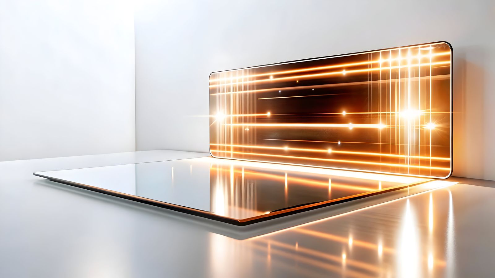
Immersive 3D Interfaces: Adding Depth to Web and Brand Experiences
3D interfaces can add depth and distinction to web experiences. Here is when to use them and how to keep performance tight.
We help teams turn insight into action with clear plans, templates, and delivery support.
Flat design served the web well for a decade. It stripped away the skeuomorphic excess of the early 2010s and made clarity the default. But clarity and depth are not opposites. In 2026, the more memorable web experiences use 3D elements, spatial depth and immersive interactions to create brand moments flat layouts cannot match, without giving up usability.
The catch is familiar. 3D on the web has a history of performance disasters, accessibility failures and gimmicks that add work without adding value. This article sets out where depth genuinely helps, how to implement it responsibly and where flat is still the better call.
Where 3D actually earns its place
Not every site needs depth. 3D elements make sense when they do one of these jobs.
Product visualisation
Showing a physical product from multiple angles in 3D gives people more to work with than a gallery of flat photos. They can rotate, zoom and inspect. That reduces purchase anxiety and can improve conversion when shape, texture and proportion matter.
Spatial storytelling
Some narratives work better in space. A brand timeline that scrolls through a spatial environment, an architectural walkthrough or a data visualisation that maps three dimensions of information can communicate things a flat layout simply cannot.
Standing out from the same old layout
When competitors all use the same flat card patterns, a restrained 3D hero or interactive product showcase creates immediate visual separation. Taste matters here. Depth for its own sake is a gimmick. Depth tied to a communication goal is a strategy.
Explaining complex subjects
Complex systems, anatomical models, mechanical processes and scientific concepts are easier to grasp when people can explore them spatially. 3D makes the abstract feel tangible.
Where 3D creates more problems than it solves
Simple content sites
If the site is mostly text and images - a blog, service pages, documentation - 3D adds loading time and complexity without improving comprehension. Flat layouts are faster, easier to maintain and easier to make accessible.
Mobile-first audiences
3D interactions that look excellent on a desktop GPU often stutter or break on mid-range phones. If most of the audience is mobile, the performance cost may outweigh the experience gain.
Accessibility-critical contexts
3D interfaces are hard to make accessible. Screen readers cannot parse a 3D scene. Keyboard navigation through spatial elements is non-standard. If the audience includes people who rely on assistive technology, every 3D element needs a complete 2D fallback.
Keeping 3D fast in practice
The biggest risk with web 3D is performance. A beautiful scene that takes 8 seconds to load is still a failed experience. The aim is to keep it light.
Technology choices
- CSS 3D transforms suit simple depth effects such as card tilts, parallax layers and perspective shifts. They are hardware-accelerated and lightweight.
- Three.js is the right fit for more complex scenes. Use it when you need real geometry, lighting and interaction, then keep the scene simple and optimise aggressively.
- WebGL gives maximum performance control, but only if the team has the expertise to handle it properly.
- Model Viewer is Google's web component for product visualisation with minimal code. It includes built-in performance optimisation and accessibility features.
Performance checklist
- 3D assets are compressed, with DRACO compression for meshes and AVIF/WebP for textures
- Scenes load progressively, starting with a static image before the interactive version arrives
- Frame rate stays above 30fps on mid-range mobile devices
- Total 3D asset size stays under 2MB for the initial load
- Offscreen 3D elements are paused to save CPU and GPU
- Reduced motion preference is respected, with a static fallback for people who want less motion
Progressive enhancement approach
The strongest 3D web implementations follow progressive enhancement.
- Base layer: a high-quality static image that works everywhere
- Enhanced layer: 3D interaction that loads after the page is usable
- Full experience: extra features such as physics, lighting and animation for capable devices
That way, everyone gets a usable experience and capable devices get the fuller version.
Shaping 3D into the brand system
Depth as a design language
Instead of bolting 3D onto isolated elements, treat depth as part of the design system.
- Elevation and shadow create a consistent sense of hierarchy across the site
- Parallax layers add subtle depth to hero sections and transitions
- Perspective shifts on hover or scroll make flat content feel spatial without full 3D
- Floating elements such as cards, images and typography create visual interest without heavy rendering
Colour and lighting in 3D
3D elements need lighting to look convincing. On the web, that usually means a few disciplined choices.
Use a consistent light direction across the interface - top-left is still the standard convention. Match shadows to the rest of the design system. Add subtle ambient occlusion if you want realism without pushing the renderer too hard. Dark backgrounds can also help 3D showcases, since they make depth easier to read and reduce contrast issues.
Typography in 3D space
3D typography can work well for headlines and hero moments, but only if it stays readable. Depth and perspective should not damage legibility. Screen readers still need a flat fallback. Use 3D text sparingly - body copy in 3D is unreadable - and keep motion under control. Spinning 3D text gets old fast.
Accessibility for 3D web experiences
3D interfaces bring real accessibility problems with them, so a responsible implementation has to deal with them directly.
Screen reader support
3D scenes are not semantic HTML. Provide descriptive aria-label attributes for 3D containers, a text summary of the 3D content in a visually hidden element and alt text for any 3D element that communicates information.
Keyboard navigation
Standard keyboard navigation does not work in 3D space. Provide keyboard controls for rotation and zoom, such as arrow keys and +/-; a clearly documented keyboard map; tab-focusable controls for all 3D interactions; and a 2D fallback that gives the same information without spatial interaction.
Motion sensitivity
3D interfaces often involve a lot of motion. Respect user preferences by checking prefers-reduced-motion and providing a static alternative, letting the user pause or disable animations, and avoiding auto-playing 3D animations on page load.
Colour and contrast
Lighting can create low-contrast patches inside a 3D scene. Text placed over 3D elements still has to meet WCAG contrast ratios. Interactive elements should be visually distinct. Focus indicators need to stay visible against 3D backgrounds.
For a broader view of accessible design fundamentals, see our creative audit checklist.
What strong 3D work has in common
The better 3D web experiences tend to follow the same pattern: they serve a specific communication goal rather than acting as decoration, they load quickly enough that the 3D enhances the page instead of blocking it, they give non-3D users the full value through fallbacks, they use depth for one or two key moments rather than everywhere, and they include accessible alternatives for every 3D element.
A sensible next step
If 3D is under consideration for a web presence, start with one high-impact element - a product viewer, a hero interaction or a data visualisation - rather than rebuilding the whole site. Test performance on real devices, especially mid-range phones. Make sure a complete 2D fallback exists.
If you want help designing immersive brand experiences that stay fast and accessible, book a call or explore our services.