Insight • Design craft
Brutalism & Anti-Design: Raw Aesthetics to Stand Out in 2026
Brutalist and anti-design aesthetics create memorability through rawness. Here is when and how to use them in 2026.
We help teams turn insight into action with clear plans, templates, and delivery support.
Most of the web looks much the same. Rounded corners, soft gradients, card-based layouts, muted colour palettes - it all starts to blur together. Brutalism and anti-design reject that sameness on purpose. They use raw typography, exposed structure, hard contrast, and awkward layouts to make something you notice straight away.
That doesn't mean brutalism suits every brand. It is a specific aesthetic choice, and the trade-offs are just as specific. This article sets out where rawness has a job to do, how to use it without wrecking usability, and where bold turns into broken.
What brutalism actually means in design
Architectural brutalism valued raw materials, exposed structure, and honesty about construction. Digital brutalism takes those ideas and applies them directly.
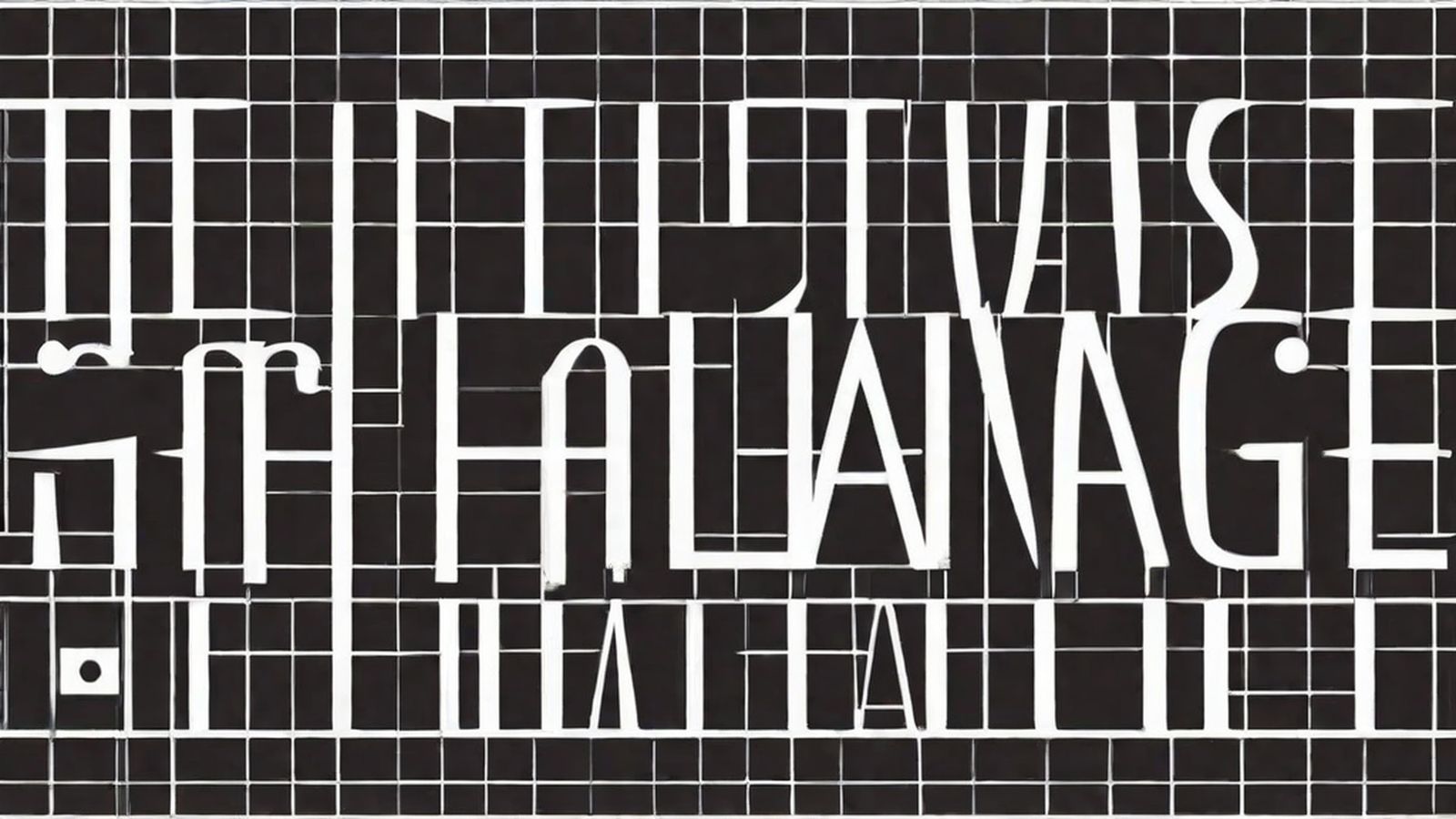
Think system fonts, default HTML elements, unstyled or only lightly styled components. Think visible grids, raw code references, exposed navigation systems. The point is not to prettify the structure. It is to let it show. Every element has to earn its place, so decorative flourishes drop away and contrast does the heavy lifting - bold type, stark colour combinations, sharp differences in scale.
Anti-design pushes further. Brutalism strips back decoration to expose structure; anti-design deliberately breaks conventions. Misaligned elements, ugly colour combinations, chaotic typography, layouts that make the viewer work a little harder - all of that sits within the same refusal to play nice.
The shared idea is simple: reject default taste and make something that demands attention because it refuses to be polite.
Why rawness works as a strategy
Attention in a saturated landscape
When every brand reaches for the same clean, modern finish, rawness stands out immediately. A brutalist site is memorable because it doesn't blend in. That kind of memorability is what brand recall rests on.
Authenticity signalling
Polished design can feel corporate and distant. Raw aesthetics suggest confidence and independence: "We don't need to look like everyone else." That lands well with audiences who value authenticity more than a neat veneer of professionalism.
Filtering audiences
Brutalism is polarising by design. It pulls in people who like boldness and puts off people who expect conventional polish. For a niche brand, that filtering can be useful. For a mass-market brand, it is a risk you need to think about before you commit.
Content focus
Strip away the decoration and the content has nowhere to hide. That is the appeal. If the writing, imagery, or product message is strong, brutalist design gives it more weight rather than less.
When brutalism works - and when it backfires
Good fits
Creative agencies and studios use it to show design confidence. Music, art, and cultural brands can lean into it because unconventionality is expected rather than excused. Tech products aimed at developers or early adopters often have room for that rawness, and fashion brands sometimes use anti-design as a statement rather than a mistake.
Editorial and media brands with strong written content can also benefit, because the layout can take a back seat to the article itself. Event and festival branding is another natural fit, where energy and impact matter more than comfort.
Bad fits
Healthcare and financial services are a poor match, because trust tends to come from perceived reliability. E-commerce is also tricky unless you're selling to a design-aware niche, since comfort and clarity usually drive conversion. Government and institutional sites need accessibility and clarity first. Mass-market consumer products face the same issue: if the design alienates even a small slice of the audience, the cost is real.
Implementing brutalist web design
Typography as the primary element
Brutalist design leans hard on typography. The type carries the personality, so the choice matters more than it would in a softer visual system.
Monospaced fonts such as Courier, JetBrains Mono, and IBM Plex Mono point back to raw code and technical honesty. Oversized headings - 100px and up - create impact and fill the viewport. Mixed scales, with enormous headlines alongside tiny body text, produce a sharp hierarchy. System fonts at their default rendering signal anti-decoration without much explanation needed.
A practical warning: brutal typography still has to be readable. Contrast ratios, line length, and line height need to support actual reading. If nobody can read the content, the aesthetic has failed.
Colour strategy
Brutalist palettes are usually stark. Black and white with one or two accent colours is the most common route. Some projects go for acid green on black, hot pink on grey, or raw amber on navy. The colours are applied flat, with no gradients and no subtle shading, just solid blocks. Warning colours - reds, yellows, oranges - are often used at full saturation rather than toned down.
If you are generating imagery to match the stark, high-contrast aesthetic, outputs vary a lot by tool. The AI image generators 2026 quality creative control comparison is a useful guide for understanding which tools give you enough precision to produce the bold, graphic compositions brutalism demands rather than the soft, atmospheric outputs that dominate most AI defaults.
Layout principles
Full-width blocks can divide the page into clear horizontal sections. Exposed grids make the structure visible through lines or borders. In anti-design, deliberate misalignment breaks the grid on purpose instead of by accident. Minimal padding creates density and urgency. Scrolljacking should be avoided; let the user control the pace.
Interactive elements
Hover states should be blunt and obvious - colour inversions, scale changes, underlines. Cursor customisation, such as large dot cursors or crosshairs, should be used sparingly. Animation is usually minimal, with static states or abrupt transitions rather than soft easing. Raw form elements can stay close to browser defaults or be only lightly styled.
Maintaining usability within rawness
The biggest criticism of brutalist design is that it sacrifices usability for style. It doesn't have to, but the risk is real.
Non-negotiable usability baselines
Navigation must be findable, even if it looks unconventional. Users still need to locate and operate it within seconds. Content has to be readable, which means contrast, font size, and line length must support actual reading rather than just visual impact. Interactive elements must be identifiable too: links should look like links, buttons should look clickable. Don't throw that away for aesthetic purity.
Mobile must work. Brutalist desktop layouts often fall apart on small screens, so design mobile-first and then add the rawness back in. Accessibility baselines still apply as well - keyboard navigation, screen reader support, sufficient contrast, and meaningful alt text are not optional, whatever the aesthetic. See our creative audit checklist for the fundamentals.
The 80/20 rule for brutalism
Use raw aesthetics on the 20% of the site that shapes brand impression - the hero, navigation, headers, transitions. Keep the 80% that people need to read and use grounded in usability. That gives you the impact of brutalism without paying the full usability cost.
Brutalism and brand voice
Brutalist visuals need a matching brand voice. If the design is raw but the copy reads like a corporate memo, the mismatch drags both parts down.
Brutalist brand voice is usually short and direct. It drops filler phrases such as "We're excited to announce..." and keeps technical precision where it matters. Dry humour or confident provocation can work. So can plain honesty about limitations.
For guidance on developing a coherent brand voice, see our brand kit workflow.
Building a brutalist design system
Brutalism does not mean chaos. A brutalist design system sets the rules for how rawness shows up.
The type scale needs to be defined: which sizes, which weights, which fonts. The colour palette should list the specific stark combinations that are allowed. Spacing rules still matter, because even minimal padding has to stay consistent. Component patterns need to cover how cards, buttons, navigation, and forms behave. It also helps to include "too far" examples, so everyone can see where the aesthetic stops being deliberate and starts becoming a usability failure.
Without that system, "brutalist" quickly turns into "broken."
What to do next
If your brand can carry rawness, brutalism is one of the fastest ways to create visual distinction in 2026. Start with a single page or campaign. Test it with your audience. Measure both impression - memorability, brand recall - and function - task completion, accessibility. Then decide whether it deserves to spread.
If you want help designing a brand experience that stands out through rawness rather than polish, book a call or explore our services.