Insight • Design craft
Collage & Scrapbook Aesthetics: Analog Charm in Digital Design
Collage and scrapbook aesthetics bring analog warmth to digital work. Here is how to use them without creating a mess.
We help teams turn insight into action with clear plans, templates, and delivery support.
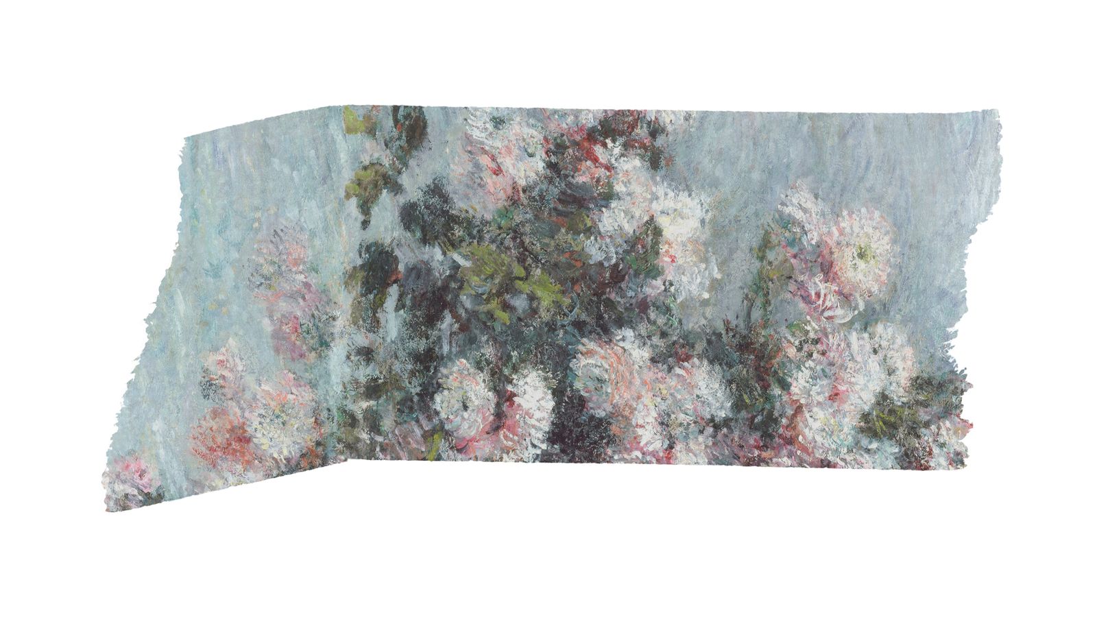
Digital design has spent a decade getting cleaner. Grids tightened, shadows softened, and one interface started to resemble the next. Now the pendulum is swinging back. Collage and scrapbook aesthetics are showing up in brand campaigns, editorial design, packaging, and web experiences, bringing texture, layering, and analog charm to digital work that can feel stripped bare.
This is not nostalgia for its own sake. Collage works because it shows what polished minimalism often hides: energy, personality, and the evidence of human decision-making. When every competitor is using the same Figma template, a hand-assembled visual style stops being decoration and starts being differentiation.
Why collage aesthetics are showing up again
Three things are pushing collage and scrapbook styles back into view.
AI sameness
AI-generated imagery and templated design have made polished visuals feel cheap and interchangeable. Collage is harder to automate well because it depends on curatorial judgement: which elements to combine, how to layer them, and where to create tension. That is why it still reads as distinctly human.
Audience fatigue with perfection
Audiences, especially younger demographics, are wary of over-produced visuals. They often read them as inauthentic. Collage signals effort and personality, and that gives it a credibility that stock photography and gradient backgrounds rarely manage.
Cultural references
Zine culture, punk aesthetics, indie publishing, and DIY maker movements are all resurfacing in the mainstream. Collage taps into those currents and links brands to ideas like independence, creativity, and community.
How collage design is put together
Effective digital collage is not random. It still follows compositional principles, even when it looks rough around the edges.
Core elements
Layering gives the work depth and hierarchy, and the order of elements matters. Texture does the rest: paper grain, tape, stamps, torn edges, halftone dots. These details point back to physical media and give the piece a tactile warmth.
Mixed media adds energy by combining photography, illustration, typography, and found materials. Hand-drawn marks such as annotations, arrows, circles, and underlines make the composition feel edited rather than generated. Typography mixing does something similar. Different typefaces, sizes, and treatments - hand-lettered, printed, stamped, cut-out - can sit together in one composition without losing coherence.
Compositional principles
Even the busiest collages need structure. One element should anchor the composition. The eye still needs a route through it. Scale, colour, and texture need enough contrast to establish hierarchy. And however dense the layout gets, there has to be breathing room. Overlap should feel intentional, not accidental.
Practical techniques for digital collage
Technique 1: Scanned textures as backgrounds
Scan real paper, fabric, or textured surfaces at high resolution and use them as background layers in digital compositions. It adds warmth that digital textures rarely match.
Production tips:
- Scan at 300dpi minimum
- Clean up dust and scratches, unless they add character
- Build a library of 10-15 textures and use it consistently across projects
- Optimise for web by compressing to JPEG at 80-85% quality
Technique 2: Torn edge and cut-out masks
Use torn paper edges or irregular cut-out shapes instead of clean rectangular crops. That breaks the grid and gives the layout a more analog feel.
Production tips:
- Scan actual torn paper for authentic edges
- Create reusable mask shapes in your design tool
- Vary the edge treatment so every image does not use the same tear
- Keep the image readable despite the irregular crop
Technique 3: Tape and adhesive elements
Washi tape, masking tape, paper clips, and pin marks can hold the composition together as well as decorate it. Used well, they create the impression that the design was assembled by hand.
Production tips:
- Photograph real tape on a plain background if you need authentic transparency
- Use it sparingly - two or three tape elements per composition is usually enough
- Change angle and positioning to avoid a mechanical look
Technique 4: Hand-lettered typography
Mix hand-lettered headlines with clean digital body text. That contrast signals craft without compromising readability.
Production tips:
- Commission or create actual hand-lettering. Digital handwriting fonts often look false
- Keep hand-lettering for headlines and callouts, not body text
- Check legibility at every target size
- For accessibility, provide clean text alternatives for screen readers
Technique 5: Layered composition in CSS
For web implementation, use CSS positioning and transforms to build layered compositions that feel collage-like:
- Slight rotation on image elements, usually 2-5 degrees
- Overlapping elements with z-index management
- Box shadows that suggest physical stacking
- Background textures applied with CSS
Keep it lightweight. The visual effect should not depend on heavy JavaScript or large asset downloads. Performance matters, and our web design trends guide covers the fundamentals.
Collage inside brand identity systems
Collage can sit inside a brand identity system, not just appear as a one-off treatment. The important part is defining the rules.
Building a collage system
Start with the element palette: which textures, typography treatments, and decorative elements are allowed? Then set layering rules. How many layers are typical? Which overlaps are encouraged? Colour needs boundaries too, or the whole thing slides into chaos. A defined palette keeps that under control.
Templates still matter. Even with a collage aesthetic, templated layouts help maintain consistency across applications. It also helps to document "too far" examples so the team can see where charming becomes messy.
For help building this into a brand kit, see our brand kit workflow.
Where collage brand identity works
Fashion and lifestyle brands are an obvious fit. So are music and entertainment, food and beverage - especially when the positioning leans artisan or craft - cultural institutions and events, independent publishers and media, and creative agencies and studios.
Where to be cautious
Corporate communications are a stretch unless the brand is deliberately anti-corporate. The same caution applies to technical documentation, financial and legal contexts, and medical and healthcare work.
Accessibility considerations for collage design
Collage aesthetics can create accessibility problems. They need handling, not ignoring.
Contrast comes first. Text has to stay readable against textured backgrounds, so test it with WCAG contrast checkers. Reading order matters too. Overlapping elements can confuse screen readers, so semantic HTML should keep a logical order even when the visuals do not. Alt text should describe the collage content meaningfully, not just say "collage image".
If collage elements animate, such as parallax or drift, respect prefers-reduced-motion. Hand-lettered or decorative text also needs accessible alternatives.
Producing collage assets at scale
One obvious concern with collage aesthetics is speed. Hand-assembled compositions take longer than templated layouts. The answer is not to fake the look with one-off improvisation every time.
Build a reusable asset library with textures, tape elements, edge masks, stamps, and decorative marks that can be mixed and matched. Create Figma or design tool components that let content swap without rebuilding the whole composition. Define three or four composition recipes so the team has standard arrangements to follow. Batch production helps too. Make series of collages in sessions rather than one at a time.
What to do next
If collage fits your brand's personality, start small. Use it on one campaign or one section of your site first. Build a texture library, test the result, and adjust from there. The best collage work is grown, not designed all at once.
If you want help developing a collage aesthetic that works at scale, book a call or explore our services.