Insight • Design craft
Handmade Typography: Imperfect, Humanized Fonts for 2026
Handmade typography builds personality and warmth. Here is how to use imperfect fonts effectively in brand and web design.
We help teams turn insight into action with clear plans, templates, and delivery support.
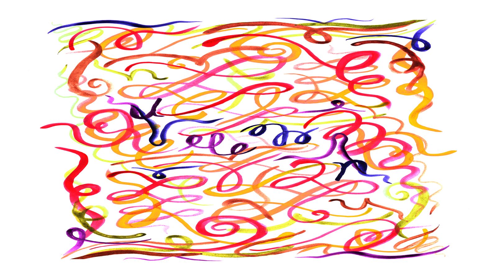
Typography has been getting more uniform. Variable fonts load faster, system font stacks look professional, and AI-generated typefaces are technically flawless. All of which makes handmade typography more valuable than it has been in years. When every competitor uses Inter or the latest geometric sans-serif, hand-lettered, rough-edged, and deliberately imperfect type becomes a genuine differentiator.
Handmade typography signals something that algorithms cannot replicate: a human made a choice. That signal builds personality, warmth, and brand recall in ways that technically perfect type cannot.
What counts as handmade typography
Handmade typography exists on a spectrum:
- Fully hand-lettered: custom letterforms drawn or painted by hand, scanned and cleaned up for digital use. Every character is unique.
- Hand-lettered fonts: typefaces designed to look hand-drawn, with natural variation built into the character set. Some include alternate glyphs and contextual ligatures to avoid repetitive patterns.
- Brush and script fonts: typefaces that reference calligraphic or painted letterforms. They carry the energy of physical tools without being literally handmade.
- Rough and distressed fonts: clean typefaces with added texture, ink spread, or erosion. These reference printed or stamped letterforms.
- Variable imperfection: clean digital typefaces with deliberate irregularities in weight, baseline, or letterform. Technically precise, but designed to feel human.
The right choice depends on the brand, the context, and the production workflow.
Why handmade type matters in 2026
Distinctiveness in a homogeneous landscape
When most brands use the same 10-15 typefaces, any departure is noticeable. Handmade type creates an immediate visual signature that audiences remember.
Warmth and personality
Handmade letterforms carry the energy of their creation. Brush strokes suggest speed and confidence. Pencil marks suggest care and deliberation. Rough edges suggest authenticity. These qualities communicate brand personality at a glance.
Resistance to AI replication
AI can generate technically proficient typefaces, but it struggles with the kind of intentional imperfection that makes handmade type charming. Hand-lettering remains one of the most difficult creative outputs for AI to replicate convincingly.
Cultural resonance
Handmade aesthetics connect to broader cultural movements: craft revival, slow making, local production, and anti-corporate sentiment. Brands that use handmade type align themselves with these values.
Where handmade typography works
Headlines and display use
Handmade type is most effective at large scales: headlines, hero sections, posters, social media graphics, and packaging. The details that make it charming (texture, irregularity, ink behavior) are visible at display sizes.
Brand marks and wordmarks
A hand-lettered wordmark creates a unique brand identifier that no other brand can share. It is inherently ownable in a way that a typeface is not.
Packaging and physical media
Handmade type thrives on physical surfaces: packaging, signage, merchandise, and print. The tactile quality of hand-drawn letterforms complements physical materials.
Campaign and editorial design
Short-form campaign headlines, editorial spreads, and social media content benefit from the energy and personality of handmade type.
Web headlines paired with clean body text
On the web, use handmade type for headlines and display elements while keeping body text in a clean, readable typeface. The contrast creates visual interest without sacrificing readability. This pairing approach aligns with the design principles in our web design trends guide.
Where to be cautious
Body text
Handmade fonts are almost always less readable at body text sizes. Use them for display, not for paragraphs.
Multilingual support
Hand-lettered fonts often have limited character sets. If your brand operates across languages, check glyph coverage before committing.
Accessibility
Highly stylized letterforms can be difficult to read for users with dyslexia or visual impairments. Always provide fallback options and test readability.
Performance on the web
Custom fonts add to page weight. Handmade fonts with large character sets and multiple alternates can be especially heavy. Subset aggressively and use font-display: swap.
Sourcing handmade typography
Commission a type designer
For a truly unique brand typeface, commission a type designer. This gives you an ownable asset that no competitor can use. Cost varies significantly, from a few hundred for a single weight display face to tens of thousands for a complete family.
License existing handmade fonts
High-quality hand-lettered and brush fonts are available from foundries and marketplaces. Look for:
- Multiple weights or styles
- Contextual alternates (to avoid repeated identical letterforms)
- Good kerning (hand-drawn fonts with poor spacing look cheap)
- Web font formats included
Create your own
If you have someone on the team who can letter, create custom type in-house. Scan hand-drawn letterforms, clean them in vector software, and build a working font or image-based type system.
Implementing handmade type in a design system
Handmade type needs structure to work at scale:
Type roles
Define where handmade type is used and where clean type takes over:
- Display/headline: handmade
- Subheadings: handmade or transitional
- Body text: clean sans-serif or serif
- UI elements: clean, system, or sans-serif
- Code and data: monospaced
Pairing rules
Handmade type needs a foil. Pair it with a clean, neutral typeface that provides contrast. The tension between rough and refined is what makes the combination work. Avoid pairing two handmade fonts (the result is chaotic, not charming).
Size and weight guidelines
Define minimum sizes for the handmade typeface. Below a certain size, the character of the type disappears and it just looks blurry. Set a minimum display size and enforce it.
Color and background
Handmade type often works best with:
- Textured or colored backgrounds (not pure white)
- Dark type on light backgrounds (the textures read better)
- Restrained color use (too many colors with handmade type creates visual noise)
Technical implementation for web
Web font formats
Ship handmade fonts in WOFF2 format for the best compression. Subset to only the characters you need (headlines typically need fewer glyphs than body text).
CSS implementation
@font-face {
  font-family: 'BrandDisplay';
  src: url('/assets/fonts/brand-display.woff2') format('woff2');
  font-display: swap;
  font-weight: 400;
}

h1, .display-text {
  font-family: 'BrandDisplay', cursive;
}
Fallback strategy
Always define a meaningful fallback. If the handmade font fails to load, the page should still look intentional:
font-family: 'BrandDisplay', 'Georgia', serif;
Performance budget
Target under 50KB for a subsetted display font. If the font is larger, consider using it as an image for the most critical instances and loading the web font asynchronously.
Handmade type and brand voice
Typography and brand voice are inseparable. Handmade type suggests:
- Approachability (brush scripts)
- Confidence (bold hand-lettering)
- Care and craft (delicate hand-drawn letterforms)
- Rebellion (rough, distressed type)
- Warmth (rounded, friendly handwriting)
Make sure the typographic personality matches the written voice. A bold, rebellious typeface paired with corporate copy creates dissonance. Our brand kit workflow covers how to align voice and visual identity.
What to do next
If your brand needs more personality, handmade typography is one of the most effective investments. Start with a single application (headline font, wordmark, or campaign type), test it across contexts, and expand if it resonates.
If you want help selecting or commissioning handmade typography for your brand, book a call or explore our services.